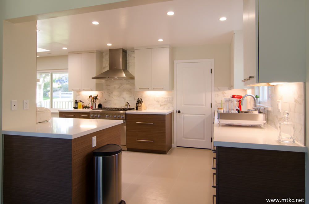
This photo album below features a full set of before and after pictures of the kitchen remodel.
In this project, we had shifted the front entrance from the foyer to the center of the kitchen wall. This allowed for a set of full depth cabinets (24″) on both sides of the room. Further, we have taken down the partition wall between the dining room and the kitchen to connect the two spaces for an open style living, and making it easier to entertain guests and having conversations. The contractor reinforced ceiling in this area with a header, 4×4’s on the sides, and new footings in the crawlspace/foundation.
For the cabinetry here, we used two separate finishes from Sollera to create the two tone effect. Painted white cabinetry on top for the stove and sink side, and horizontal grain, quartersawn walnut veneers for the rest of the cabinetry. The darker cabinetry made for a sophisticated look, while the white cabinets at the eye level helped prevented the room from being overly dark. White Caesarstone was used for the counters, along with white marble tile back splash.
We freshened up the rest of the room with a new coat of paint, new recessed canned lights, new tiled flooring, and last but not least, covered up with brick wall with new sheetrock.
In you are interested in reading up on the weekly break down of construction schedule, please visit our “Typical Construction Schedule” post.
[nggallery id=2]


